Historical context
When I joined Snaplii in late 2023, the company was shifting from a local membership discount platform serving the Chinese community in Canada to a broader e-gift card and rewards platform.
At the time, buying discounted gift cards for personal use was already more familiar in the U.S., but still relatively new in Canada. This created higher marketing and user education costs, making clarity, trust, and value communication central to the redesign.
Membership Discount Platform
Local & community-focused
- Serve Chinese community in Canada
- Local small businesses partnerships
- Membership discounts for restaurants & supermarkets
- Limited market reach & product scope
E-Gift Card & Rewards Platform
Broader & more scalable
- Broader North American audience
- National brands, gift cards & bill payment
- In-app cashback rewards loop
- Scalable product ecosystem
Overview
As Snaplii expanded beyond its original community-focused membership model, the team was often designing through ambiguity. I partnered closely with product, engineering, and marketing to translate evolving business goals into clear, testable product experiences.
I led multiple rounds of user interviews and combined qualitative feedback with product data to help the team better understand North American users. Through iterative feature enhancements, we reduced the app's learning curve and made the experience feel more intuitive and familiar to a broader audience.
The following three initiatives are selected highlights from this broader redesign effort.
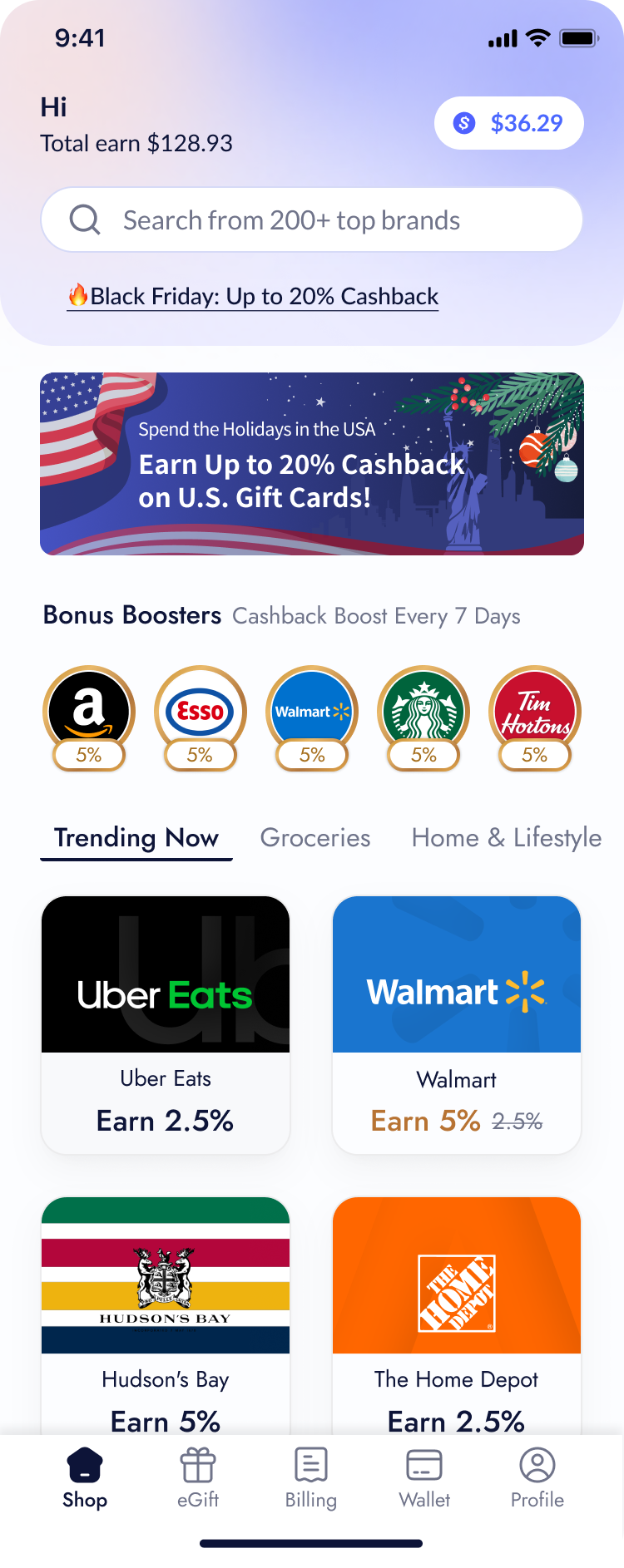
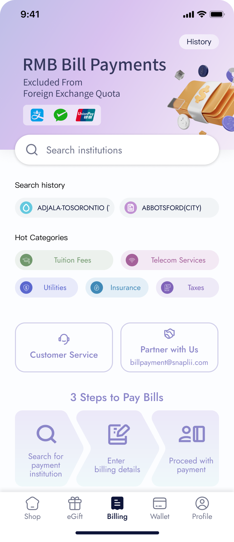
Homepage Redesign
Improved brand discovery and helped new users understand what Snaplii offered.
Building a Scalable Checkout System
Created a more scalable checkout structure as cashback, bill payment, and new payment rules were introduced.
Clarifying Promotional Offers
Clarified how discounts, cashback, and promotional offers were presented across the app.
Workstream 1
Snaplii Homepage Redesign
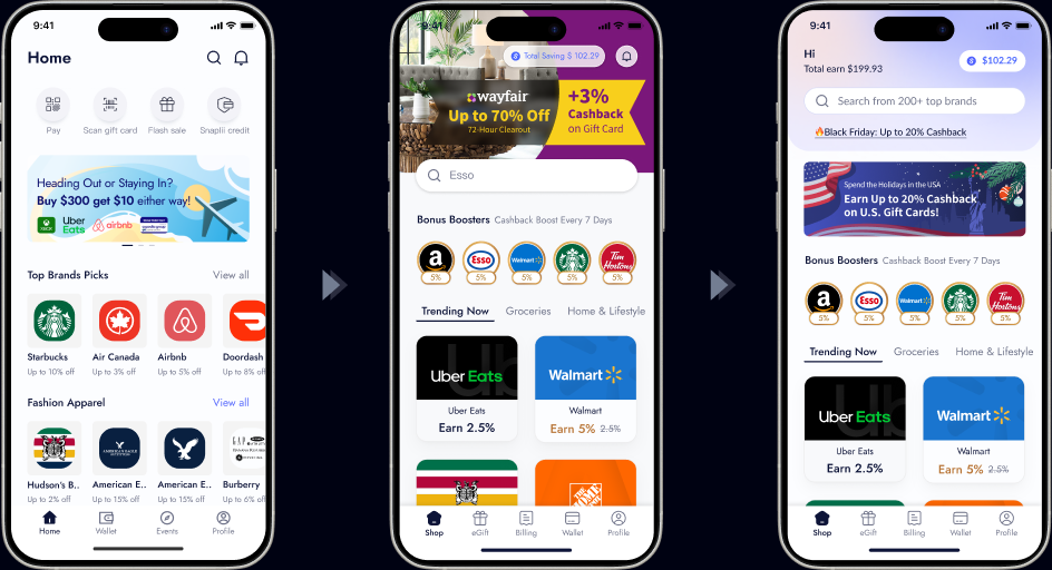
The original homepage and search experience were not aligned with local user habits and still retained outdated features from legacy business models. In addition, the marketing team needed more flexible space on the homepage to support promotional campaigns and dynamic content placement.
Refocus the homepage experience around the platform's core value proposition: offering a wide selection of digital gift cards at discounted prices. The new design aimed to clearly communicate the savings users could enjoy, helping them instantly recognize the platform as a smart and cost-effective shopping destination.
As an early-stage startup with aggressive go-to-market goals, we needed to communicate value clearly and quickly. However, the design team—deeply influenced by Chinese design aesthetics—tended to favor dense, information-heavy layouts aimed at maximizing "screen efficiency." While effective in some Asian markets, this approach proved misaligned with North American user expectations, often leading to cognitive overload and reduced engagement.
I took ownership of the end-to-end design process, from interpreting user behavior through data, to planning and conducting multiple rounds of user testing. Through close collaboration with key stakeholders, I was able to align evolving business needs with user-centric design decisions, resulting in a more focused and intuitive experience.
Workstream 2
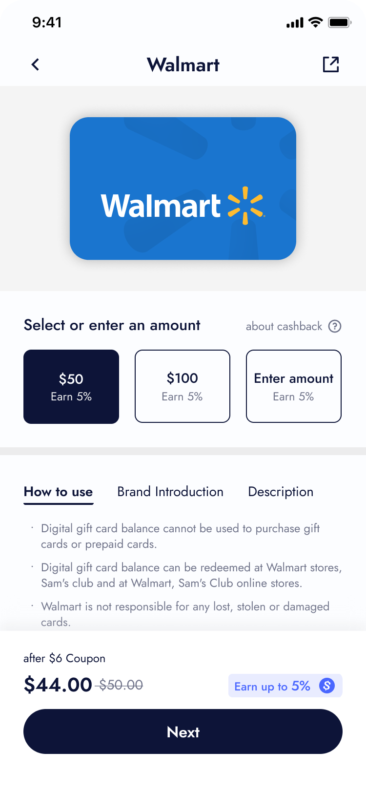
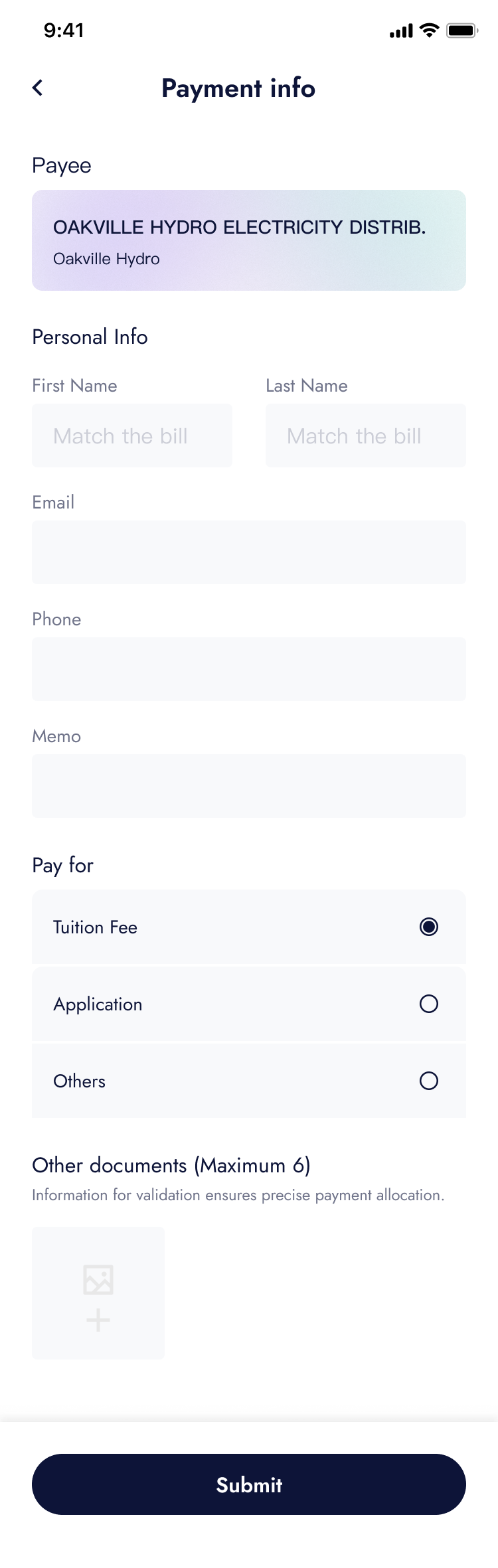
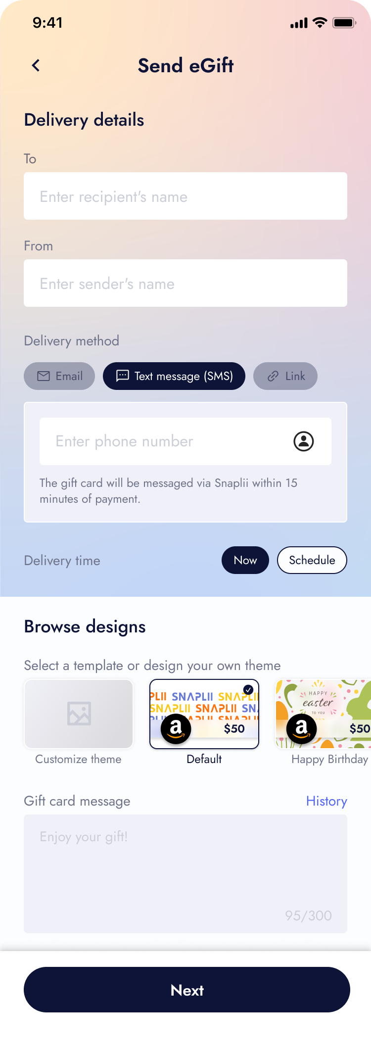
Building a Scalable Checkout System
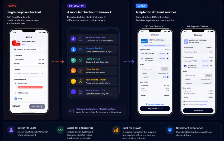
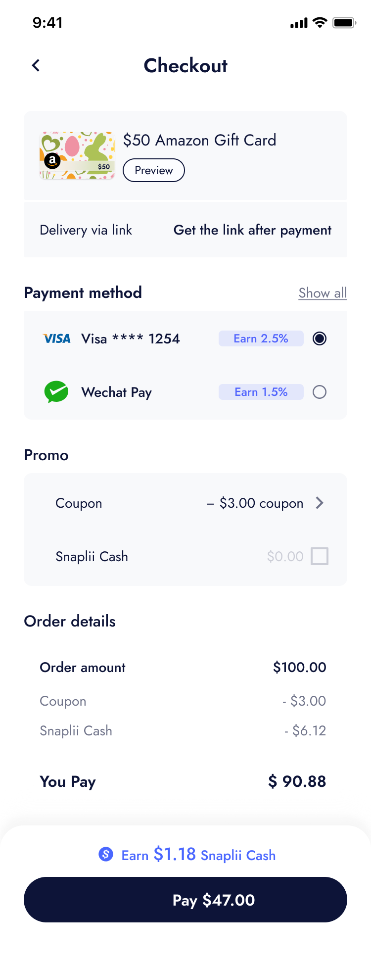
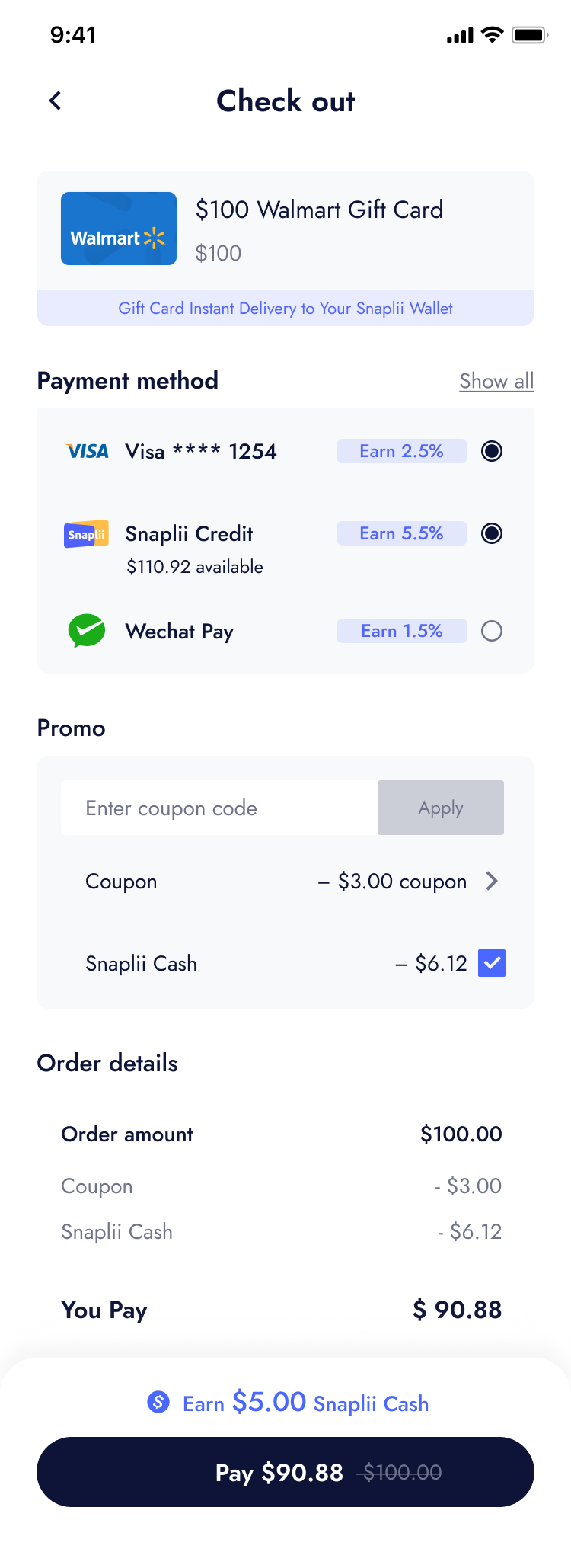
As Snaplii expanded beyond gift cards into services like bill payment, cashback, and new promotional models, the original checkout flow became difficult to scale. Each new business rule introduced new payment logic, offer logic, and confirmation requirements, creating a risk of inconsistent user experience and higher development cost.
Create a modular checkout framework that could keep the experience consistent while adapting to different products, payment methods, promotional rules, and order details.
Each service introduced different product details, payment logic, promo rules, fees, and confirmation requirements. Even within gift cards, self-use and gifting created different information needs, from cashback rewards, delivery, and redemption details to recipient information, gift messaging, and preview states. Bill payment added another layer of complexity with account details, service fees, and required agreement confirmations. The challenge was to keep checkout familiar and consistent while allowing each scenario to present the right information.
I redesigned checkout as a modular framework, breaking the flow into reusable sections: product information, payment method, promo system, order details, agreements, and sticky bottom CTA. Each module followed a consistent structure but allowed content-level customization based on the service type.
I also documented key states and edge cases, especially for product information, payment methods, coupons, and Snaplii Cash. This helped product and engineering align on how the checkout should behave across different scenarios, while giving users a more predictable experience.
The new framework improved consistency across gift card and bill payment flows, reduced design and engineering ambiguity, and created a more scalable foundation for future Snaplii services.
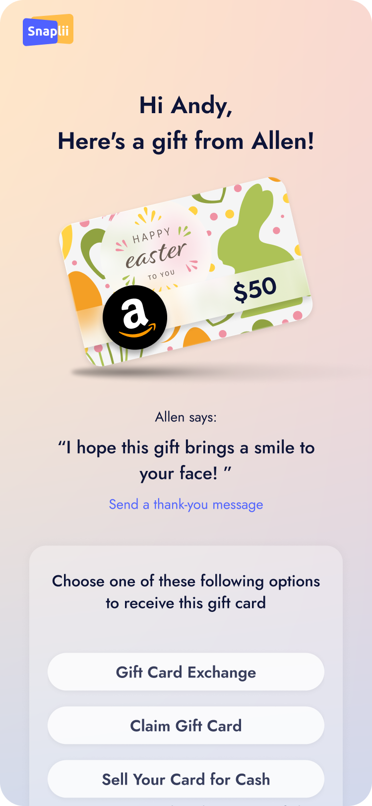
Workstream 3
Clarifying Promotional Offers Across the App
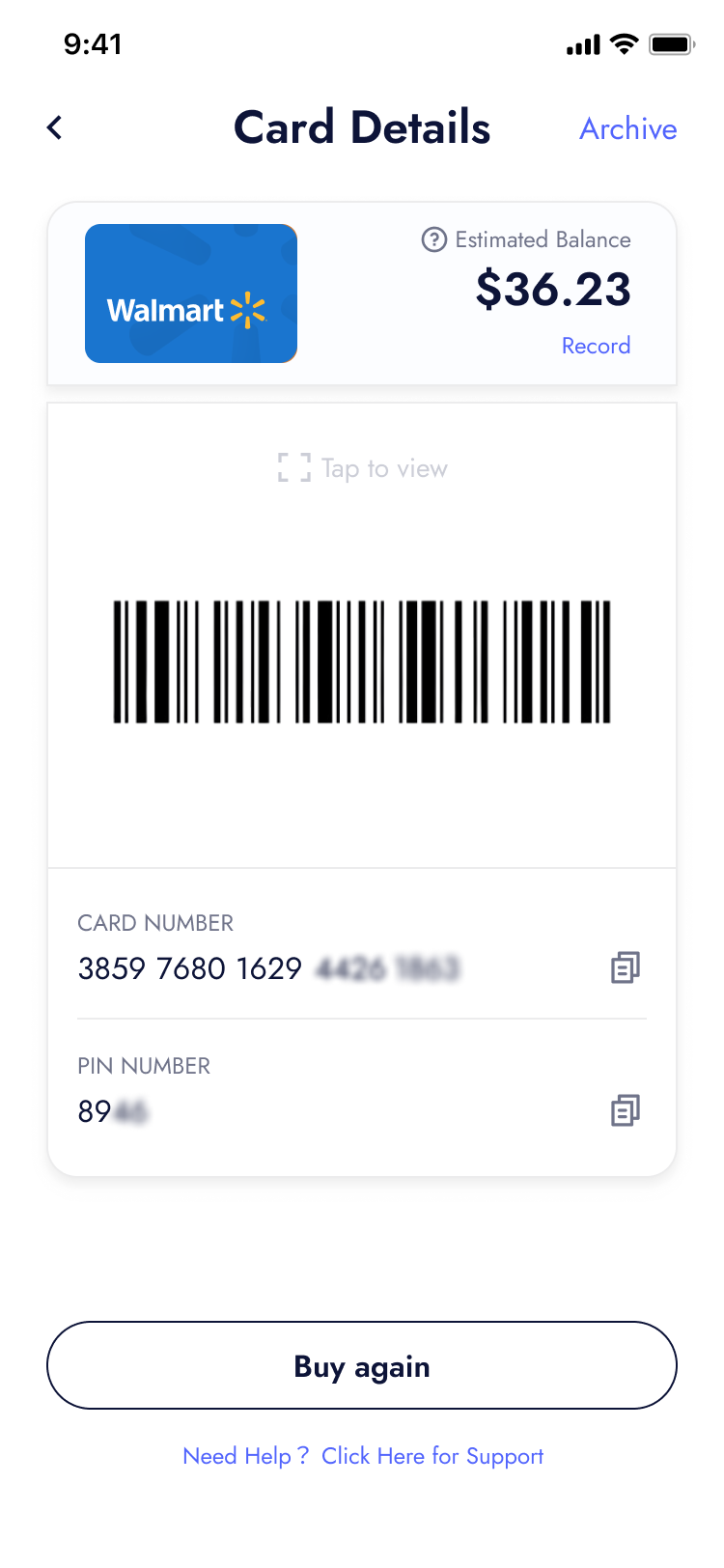
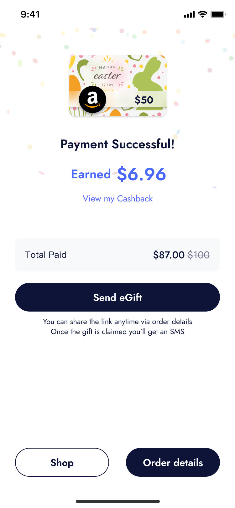
Snaplii aimed to position itself as a money-saving platform. However, early implementations—such as coupon-style discounts tailored to Chinese users and later Snaplii Cash cashback—were unfamiliar to local audiences. As a result, users often received rewards without realizing it, leading to a weak perception of value.
Make savings feel visible and tangible—whether through coupon redemption or Snaplii Cash rewards—so users clearly understand the value they're getting.
I led the redesign of key moments in the purchase flow—bringing coupons forward to the card detail page, optimizing the success screen to showcase earned cashback, and introducing microinteractions that subtly reinforced the platform's savings value.
Conclusion
Working as a Senior UX Designer at Snaplii was a meaningful chapter of creativity, experimentation, and growth. I worked across core product improvements and new business explorations, including games, rewards, and emerging fintech features. Some ideas succeeded, while others were paused or sunset, but each helped the team learn faster in a fast-changing environment.
My biggest takeaway was a deeper understanding of localization. For a product expanding into a broader North American market, it is not just about language or visual style. It is about making the experience feel familiar, credible, and easy to act on while preserving the product's unique value.
Working with such an entrepreneurial team, full of bold ideas and commercial creativity, was both exciting and challenging, and I'm proud to have been part of that journey.